Or just “infographics” for short, these have evolved in recent years to be primary communication tools in museums, news articles, white papers, and mass media.
Information graphics for Visual Storytelling
Creating data-driven visual narratives to inform & inspire
Infographics — a combination of “information” and “graphics” — are graphic visual representations of information, data, or knowledge intended to present information quickly and clearly.
This integration of data, spatial mapping, typography, and graphic design is a powerful combination for telling a moving story.
Our team works to integrate both the narrative and the numbers for maximum impact with your audience.
InfoGraphics = Data + storY
Data is everywhere — but understanding it is another story.
At Alphachimp, we help teams, educators, and organizations transform complex data into clear, emotional, and memorable information graphics.
Our visuals don’t just make data pretty;
they make information meaningful.
Whether it’s a process map, annual report, or exhibit display, our infographics turn numbers and insights into stories people actually remember and act on.
Transforming Data into Clarity and Emotion
An effective information graphic does more than organize facts — it sparks comprehension.
Our process combines research, design thinking, and visual storytelling to highlight the why behind your data. We find the narrative thread that connects numbers to purpose.
We work with:
Universities to visualize complex research
Corporations to communicate impact and innovation
Nonprofits to inspire action through data storytelling
Event producers to create memorable displays and takeaways
Each project begins with understanding your audience and the job your data needs to do — to inform, persuade, or inspire.
How Alphachimp Designs
Impactful Infographics

Our team uses tools like Adobe Creative Suite, Procreate, and Apple Keynote to create visuals that feel alive and human, not machine-made.
We collaborate closely with clients to ensure every element serves the story. From color psychology to typography to the flow of information, each choice is intentional.
Our deliverables include:
Editorial infographics for publications
Data-driven storyboards for video and presentations
Process and systems maps for innovation teams
Visual summaries for reports and exhibitions
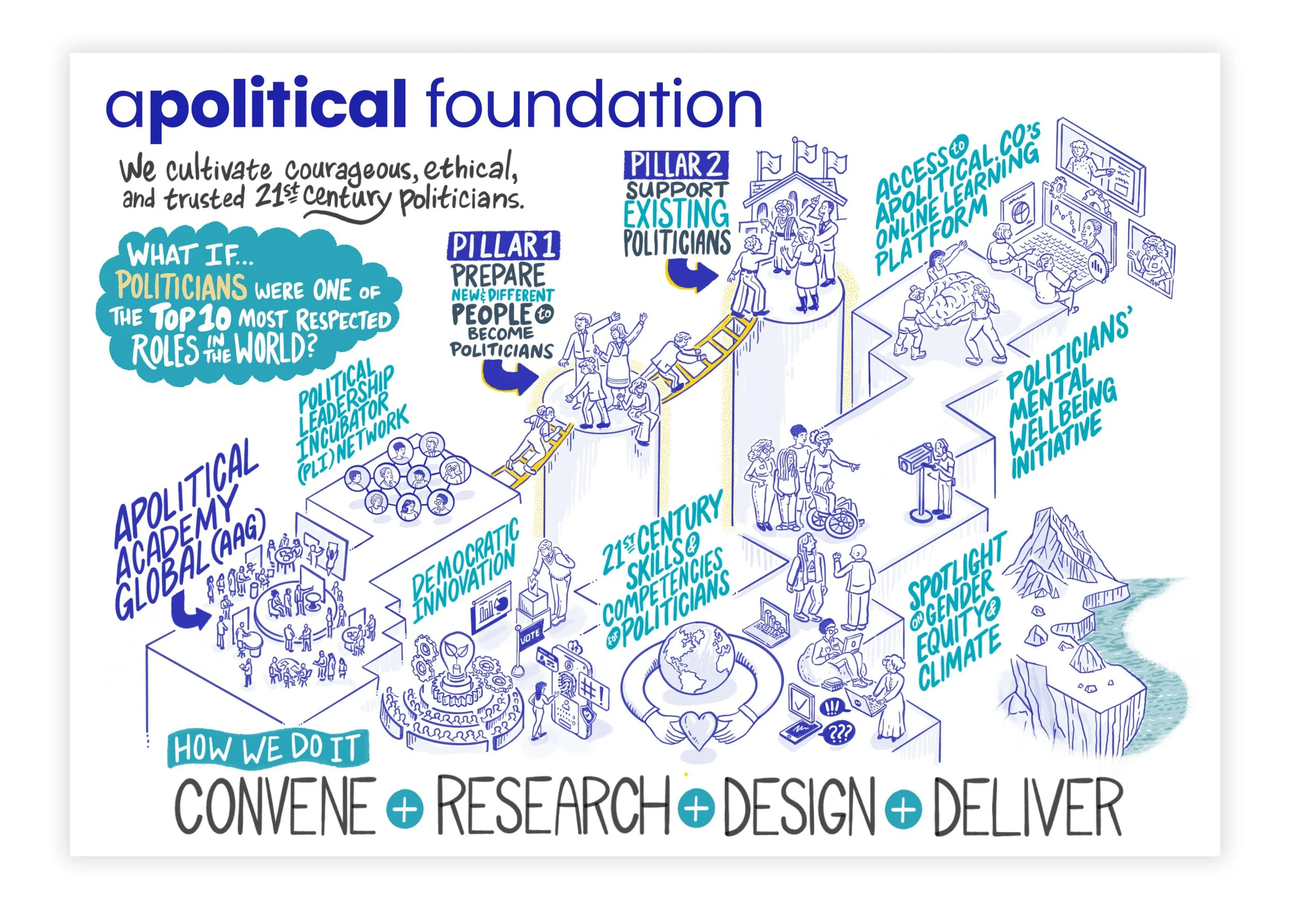
CASE STUDY #1: Visualizing the Community Health Worker Ecosystem >>
Why Visual Storytelling Works
(Backed by Research)
Cognitive science confirms what artists have always known: we remember visuals far better than words.
According to research by Paivio (1990) and Lester (2014), visuals can improve comprehension by up to 400% and are processed 60,000 times faster than text.
In other words — show it, don’t just say it.
Visual storytelling bridges disciplines, languages, and perspectives. It’s how organizations build shared understanding across complex systems.
Start Your Information Graphics Project
Ready to visualize your story?
Whether you need a data-rich report, campaign infographic, or museum exhibit, Alphachimp brings two decades of experience helping organizations see what they think and show what they mean.
📩 Contact Us to discuss your next project — or explore our related services: